Hey there, fellow digital explorers and marketing mavens! Today, we're diving deep into the mysterious and oh-so-important world of product page design, specifically the ones belonging to those DTC (Direct-to-Consumer) brands that are raking in the big bucks – we're talking tens of millions of dollars in annual sales here! Buckle up, because this is going to be a wild and hopefully hilarious ride through the land of pixels and persuasion.
What's the Big Deal with DTC Brands Anyway?
First things first, let's chat about why these DTC brands are like the cool kids on the digital block. They cut out the middleman (goodbye, pesky retailers taking a slice of the pie) and go straight to us, the consumers. It's like they're saying, "Hey, you! We've got this amazing thing, and we're gonna bring it right to your doorstep without all that fuss." And boy, do they know how to make an entrance. With their flashy ads on social media and those targeted emails that somehow always seem to land in our inboxes at just the right time (creepy or clever? You decide).
But here's the thing – they can't just rely on getting our attention with their marketing gimmicks. Once we click that link and land on their product page, that's where the real magic (or disaster) happens. It's like the product page is the ultimate stage, and the product is the star of the show. If the stage is shabby or the lighting is all wrong (in digital terms, of course), the star might not shine as brightly as it should, and we, the discerning audience, might just wander off to find a better show elsewhere.
The Anatomy of a Million-Dollar Product Page
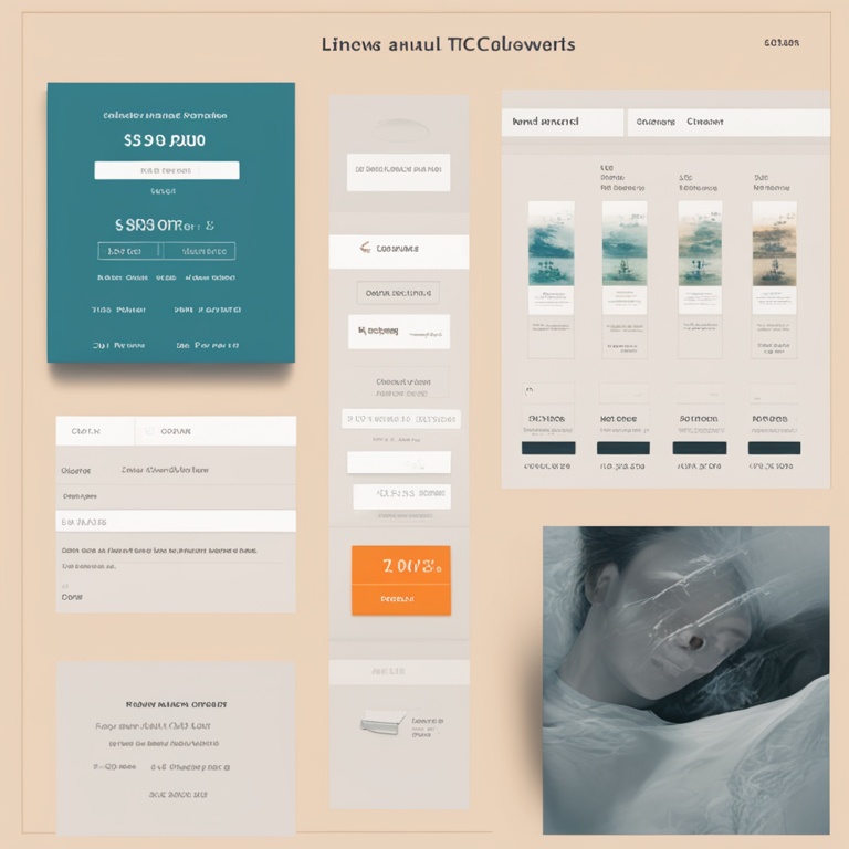
Now, let's get down to the nitty-gritty and dissect these million-dollar product pages like we're forensic scientists of the digital world. Picture this: we've got our lab coats on (okay, maybe just our comfy PJs), and we're armed with our magnifying glasses (or in this case, our eagle-eyed scrutiny of web design elements).
1. The Hero Image – The Digital Red Carpet
The hero image is like the red carpet that welcomes us to the product's grand premiere. It's gotta be eye-catching, like a Hollywood star strutting their stuff. These DTC brands don't mess around with some blurry, half-hearted photo. Oh no! They splash a big, beautiful, high-resolution image of their product right there at the top of the page. It's like the product is saying, "Look at me! I'm fabulous and you need me in your life." And if it's a piece of clothing, it's probably on a model who looks like they just stepped out of a Vogue photoshoot, with the perfect pose and that air of "I'm too cool for school but you can be this cool too if you buy this."
But it's not just about looking good. The hero image also has to give us a clear idea of what the product actually is. No one wants to be left guessing, like "Is that a blender or some kind of alien spaceship gadget?" It needs to show the product in its best light (literally and figuratively), highlighting its key features. Maybe it's a shiny new smartphone, and the hero image shows off its sleek design and that big, beautiful screen that's just begging to be swiped.
2. The Product Description – The Storyteller
Next up is the product description, and this is where the brand gets to tell us the story of their product. It's not just a boring list of specs like "This thing has 2GB of RAM and a 5-inch screen." No way! They spin a yarn that makes us care about the product on a deeper level.
They might start with something like, "Imagine a world where your mornings are transformed by the perfect cup of coffee, brewed to absolute perfection every single time. That's what our revolutionary coffee maker is all about." See what they did there? They painted a picture in our minds, and now we're imagining ourselves sipping that heavenly coffee, all thanks to their product.
Of course, they do slip in the important details too. But it's done in a way that doesn't feel like we're reading a technical manual. They'll say something like, "Our coffee maker features a precision temperature control system that ensures your coffee is always brewed at the ideal temperature, between 195°F and 205°F, for that rich, full-bodied flavor." So we get the facts, but we're also still hooked on the story.
3. The Social Proof – The Popularity Contest
Ah, social proof. This is like the popularity contest of the digital world. We humans are social creatures, and we like to know that other people are loving and using the product before we take the plunge.
These DTC brands know this all too well, so they plaster their product pages with testimonials, reviews, and user-generated content. It might be a quote from a happy customer saying, "I've never had a better night's sleep since I bought this amazing mattress! It's like sleeping on a cloud." Or they'll show pictures of people using the product in real-life situations, like a family having a blast with their new outdoor grill on a sunny Sunday afternoon.
And don't even get me started on the star ratings. If a product has a bunch of shiny five-star ratings, it's like it's wearing a badge of honor. We see that and think, "Well, if all these people love it, it must be good!" But of course, the brands have to be careful not to fake it. We're not stupid, and if we catch them trying to pull a fast one with phony reviews, we'll be outta there faster than you can say "scam."
4. The Call to Action – The Big Push
Finally, we come to the call to action (CTA). This is the moment when the brand is like, "Okay, you've seen the product, you've heard the story, you know other people love it. Now BUY IT!" The CTA button is usually big, bold, and brightly colored. It's like it's shouting at us, "Click me! Click me now!"
But it's not just about the looks. The wording on the CTA button is crucial too. It can't be some wishy-washy thing like "Maybe consider purchasing this." No way! It needs to be something strong and direct, like "Buy Now" or "Add to Cart." And the placement of the CTA button is also key. It should be right there where we can't miss it, usually near the bottom of the product page after we've been wowed by all the other elements.
Some brands even get creative with their CTAs. They might say something like, "Join the thousands of satisfied customers and get yours today!" or "Don't miss out on this life-changing product. Act now!" It's all about creating a sense of urgency and making us feel like if we don't act right away, we'll be missing out on something amazing.
The Don'ts of Product Page Design
Now that we've covered what these million-dollar product pages should do, let's talk about what they definitely should not do. Because let's face it, there are plenty of ways to screw up a product page and send potential customers running for the hills.
1. Overloading with Information
Some brands seem to think that the more information they cram onto the product page, the better. But that's just not true! If we're bombarded with a wall of text that goes on and on and on about every single little detail of the product, our eyes will glaze over, and we'll quickly lose interest.
It's like going to a party and having someone talk your ear off about every single thing they've ever done in their life. You just want to escape! The same goes for product pages. Keep it concise, focus on the key points, and let the other elements (like the hero image and social proof) do some of the talking too.
2. Bad Navigation
Imagine you're in a big, fancy store, and you can't find your way around. You're constantly getting lost in the aisles, and it's a total nightmare. Well, the same thing can happen on a product page if the navigation is bad.
There should be clear links to related products, FAQs, and the shopping cart. If we have to hunt around for these things like we're on a treasure hunt (and not a fun one), we'll probably just give up and go elsewhere. And don't even get me started on those drop-down menus that are so hard to figure out. If it takes more than a few seconds to find what we want, it's a no-go.
3. Slow Loading Times
We live in a world where we want everything right now! If a product page takes forever to load, we'll be tapping our fingers impatiently and then probably just closing the tab and moving on. It's like waiting in line at the DMV, but worse because we have the option to just leave.
These DTC brands need to make sure their product pages are optimized for speed. That means compressing images, minimizing code, and doing whatever it takes to get that page to load in a flash. Because if we're not seeing the product page within a reasonable amount of time, we won't be seeing their product in our shopping carts either.
Conclusion
So there you have it, folks! The ins and outs of the product page design of those DTC brands that are making bank with their annual sales in the tens of millions of dollars. It's a delicate dance between aesthetics, storytelling, social proof, and that all-important call to action.
Next time you land on a product page, whether it's for a shiny new gadget or a trendy piece of clothing, take a moment to analyze it. See if it follows the rules we've talked about here or if it's making some of the big mistakes. And who knows, maybe you'll even be inspired to create your own amazing product page one day (and make your own millions in the process, fingers crossed!).
Until then, happy shopping (or product page critiquing)!