Hey there, Shopify store owners!
We all know that having a great-looking and highly functional Shopify store is crucial, but when it comes to actually making those sales, it's all about the product pages. Today, I'm going to share with you some proven tips on how to set up and optimize your Shopify product pages to boost those conversion rates. So, let's dive right in!
1. The Importance of a Great Product Page
Your product page is like a virtual salesperson for each of your items. It's the place where customers make the decision to either add to cart or move on. A well-designed and optimized product page can engage visitors, build trust, and ultimately convince them to complete a purchase.
Think about it from a customer's perspective. When you land on a product page, you want to quickly understand what the product is, what it does, if it's right for you, and how much it costs. If any of these elements are unclear or presented in a confusing way, chances are you'll leave the page without making a purchase.
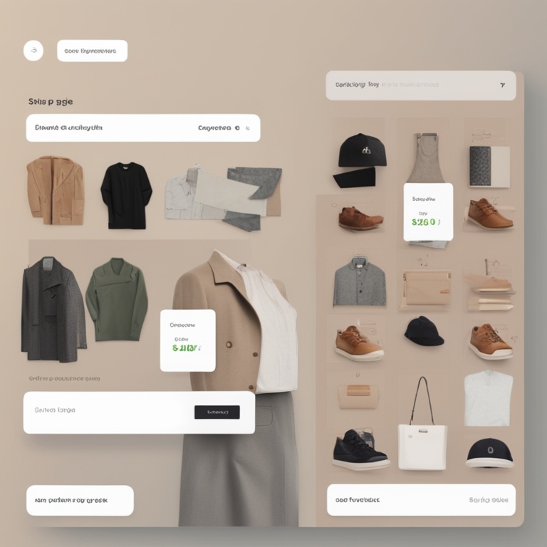
2. Designing an Eye-Catching Product Page Layout
First things first, let's talk about the layout of your product page. The overall look and feel should be clean, organized, and visually appealing.
2.1 High-Quality Product Images
Images are everything! They are the first thing customers notice when they land on your product page. Make sure to use high-quality, clear, and professional-looking images. Include multiple angles of the product so customers can get a full view. You can also consider adding zoom functionality to allow them to examine the details closely.
For example, if you're selling clothing, show the front, back, side, and details like buttons, zippers, or fabric texture. If it's an electronic device, show it from different sides, with the screen on and off, and any unique features highlighted.
2.2 Product Title and Description Placement
The product title should be prominently displayed at the top of the page. It should be clear, concise, and accurately describe the product. Avoid using overly complicated or jargon-filled titles. The description should follow closely below, providing detailed information about the product's features, benefits, and how it can solve the customer's problem.
Let's say you're selling a fitness tracker. Your title could be something like "Advanced Fitness Tracker - Track Your Steps, Heart Rate, and Sleep" and the description could go into details about its accuracy, battery life, compatibility with different apps, and how it can help users achieve their fitness goals.
2.3 Use of White Space
Don't overcrowd your product page. Leave enough white space around elements to make the page look clean and easy to read. White space helps to draw attention to the important parts of the page, like the product images and call-to-action buttons.
For instance, instead of cramming all the product details and images together in a small area, give each element its own breathing room. This will make the page feel less chaotic and more inviting to the customer.
3. Writing Compelling Product Descriptions
Now that we've covered the layout, let's focus on the content of your product descriptions. A great product description can make all the difference in convincing a customer to buy.
3.1 Know Your Audience
Before you start writing, think about who your target audience is. What are their needs, wants, and pain points? Tailor your description to address these specifically. If you're selling to busy professionals, emphasize how your product can save them time or make their lives easier. If it's for fitness enthusiasts, talk about how it can enhance their workouts or help them reach their fitness goals.
For example, if you're selling a portable coffee maker targeted at travelers, you could mention how it's lightweight, easy to pack, and can brew a delicious cup of coffee anywhere, saving them from having to search for a coffee shop on their travels.
3.2 Highlight the Benefits
Don't just list the features of the product; focus on the benefits. Customers want to know what's in it for them. If your product has a long battery life, don't just say "Battery life: 10 hours". Instead, say something like "Enjoy uninterrupted use for up to 10 hours with our long-lasting battery, so you can stay connected all day long without having to worry about recharging."
Another example, if you're selling a skincare product with natural ingredients, highlight how those ingredients can nourish the skin, reduce wrinkles, and give a healthy glow, rather than just listing the ingredients themselves.
3.3 Use Persuasive Language
Use words and phrases that persuade and engage the customer. Words like "amazing", "incredible", "must-have", and "transformative" can add excitement to your description. But be careful not to overdo it; you still want to maintain a sense of authenticity.
For instance, instead of saying "This is a good shirt", you could say "This incredible shirt is a must-have for your wardrobe. Its soft fabric and stylish design will transform your look and make you feel amazing every time you wear it."
4. Pricing and Call-to-Action Buttons
The way you present your pricing and the call-to-action (CTA) buttons on your product page can have a significant impact on conversions.
4.1 Clear Pricing Display
Make sure your pricing is clearly visible on the page. Don't hide it or make it difficult to find. If there are any discounts or promotions, display them prominently as well. Customers like to know exactly what they're paying for and if they're getting a good deal.
For example, if you're offering a 20% discount on a product, show the original price crossed out and the discounted price in a larger, bolder font. This makes it clear that there's a savings opportunity.
4.2 Compelling CTA Buttons
Your CTA buttons should stand out and be easy to find. Use contrasting colors to make them pop. The text on the button should be clear and action-oriented, like "Add to Cart", "Buy Now", or "Learn More". Make sure the button is large enough to be clicked easily on both desktop and mobile devices.
When a customer clicks on the CTA button, they should be taken to the next step in the purchasing process smoothly. There should be no confusion or glitches in the transition.
5. Customer Reviews and Testimonials
Customer reviews and testimonials are like gold on your product page. They provide social proof that your product is worth buying and can build trust with potential customers.
5.1 Displaying Reviews
Make sure to display customer reviews prominently on your product page. You can either use a dedicated review plugin or create a custom section for reviews. Include both positive and negative reviews (but try to address any negative ones quickly and publicly). This shows that you're confident in your product and are willing to listen to customer feedback.
For example, if you're selling a book, you could display reviews like "This book was amazing! It really helped me understand the topic better" and also "I had a few issues with the formatting, but the content was great".
5.2 Encouraging Reviews
Don't just wait for customers to leave reviews; actively encourage them to do so. You can send follow-up emails after a purchase asking for their feedback, offer incentives like a small discount on their next purchase for leaving a review, or create a simple form on your product page where they can leave their comments easily.
For instance, in the follow-up email, you could say something like "We hope you enjoyed your purchase! Please take a few minutes to leave a review and let us know how we can improve. As a thank you, we'll offer you a 10% discount on your next purchase."
6. Mobile Optimization
With more and more people shopping on their mobile devices, it's essential that your Shopify product pages are optimized for mobile. A poor mobile experience can lead to lost sales.
6.1 Responsive Design
Your product page should look great and function well on all mobile devices, from smartphones to tablets. This means using a responsive design that adjusts the layout and sizing of elements according to the screen size. Images should resize automatically, text should be legible, and buttons should be easy to click.
For example, if you have a large product image on the desktop version, it should scale down proportionally on a mobile device so that it doesn't take up too much space and is still clear to see.
6.2 Mobile-Friendly Navigation
Navigation on your mobile product page should be simple and intuitive. Avoid using complex dropdown menus or too many links that can be confusing. A simple hamburger menu or swipe gestures can be used to access different sections of the page.
For instance, if you have a lot of product details, you can use swipe gestures to scroll through them on a mobile device instead of having a long list of links that need to be clicked one by one.
7. SEO Optimization for Product Pages
Optimizing your product pages for search engines can help drive more organic traffic to your Shopify store. Here are some key tips for SEO optimization.
7.1 Keyword Research
Before you start writing your product titles and descriptions, do some keyword research. Find out what keywords your target audience is using to search for products like yours. Use tools like Google Keyword Planner or SEMrush to identify relevant keywords with high search volumes and low competition.
For example, if you're selling handmade candles, you might find that keywords like "handmade scented candles", "artisanal candles", and "natural wax candles" are popular among your target audience.
7.2 Optimizing Titles and Descriptions for SEO
Once you've identified the keywords, incorporate them into your product titles and descriptions. But don't just stuff them in; make sure they fit naturally. Your title should still be clear and concise, and your description should provide valuable information about the product.
For example, if one of your keywords is "handmade scented candles", your title could be "Beautiful Handmade Scented Candles - Handcrafted with Love" and your description could mention how the candles are made with natural wax, what scents are available, and how they can create a cozy atmosphere in your home.
7.3 Meta Tags and Alt Text
Don't forget about meta tags and alt text for your product images. Meta tags provide additional information about your page to search engines. Alt text for images is used to describe the image when it can't be displayed or for accessibility purposes. Include relevant keywords in your meta tags and alt text to improve your SEO.
For example, for a product image of a handmade scented candle, the alt text could be "Handmade scented candle with lavender scent - perfect for creating a cozy atmosphere".
8. A/B Testing
Finally, one of the most effective ways to optimize your product pages is through A/B testing. This involves creating two versions of a page (Version A and Version B) with different elements or changes and then testing which one performs better in terms of conversions.
8.1 What to Test
You can test a variety of things on your product pages, such as different product images, different product descriptions, different pricing displays, or different CTA button designs. The key is to isolate one variable at a time so you can accurately determine which change is having an impact on conversions.
For example, you could test whether a more detailed product description leads to higher conversions than a shorter one, or whether a red CTA button gets more clicks than a blue one.
8.1 How to Conduct A/B Testing
There are several tools available for A/B testing on Shopify, such as Google Optimize or Shopify's built-in A/B testing feature. Set up your test, define your goals (usually conversions), and then let the test run for a sufficient period of time to collect enough data. Analyze the results and implement the changes that lead to better performance.
For example, if you find that Version B of your product page with a different product image has a higher conversion rate than Version A, then you should adopt the new product image for your page.
So there you have it, folks! These are some proven tips for setting up and optimizing your Shopify product pages to boost those conversion rates. Remember, it's all about creating a great user experience, providing valuable information, and building trust with your customers. Happy optimizing!